The PATHway — Brand Identity & Web Development
The new identity elevated The PATHway into a polished, credible practice with a grounding digital presence. The brand now communicates emotional safety, professionalism, and clarity, helping clients feel supported from the first touchpoint.
The PATHway is a therapy and wellness practice offering EMDR therapy, mental health evaluations, and court-mandated services. The practice focuses on compassionate, judgment-free care and needed a brand identity and website that reflected warmth, emotional safety, and cultural grounding.
Approach
The PATHway lacked a cohesive visual identity and digital presence. The goal was to create a brand system that felt professional yet calming, avoiding clinical coldness while emphasizing trust, clarity, and healing. The practice also needed a website that clearly communicated services and guided prospective clients with ease.
The Challenge

Website Development
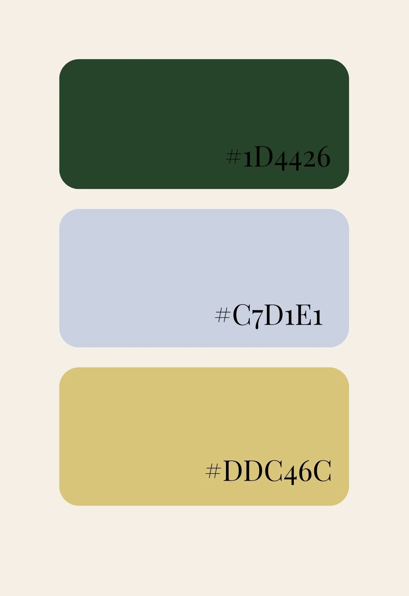
I designed the brand around grounded, restorative visual cues:
Deep green for growth and stability
Soft blue for calm and clarity
Warm gold for optimism and renewal
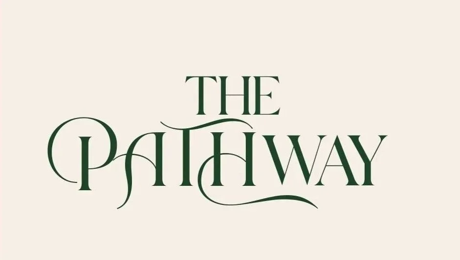
A custom, elegant wordmark was created to symbolize the non-linear nature of healing. The visual language uses natural imagery, soft textures, and minimal, spacious layouts to support emotional ease.
The website was built to feel welcoming and simple to navigate, with:
Clear service categories
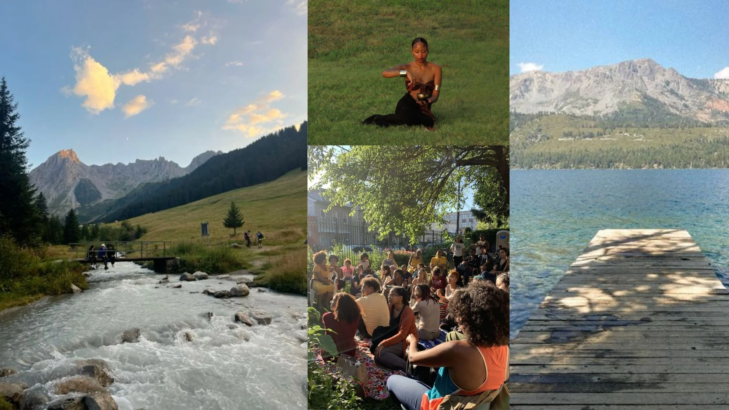
Warm imagery that reflects the practice
Soft color blocking and open spacing
Copy centered on safety, worthiness, and transformation