SoulFull Wellness Collective — Brand Identity
SoulFull Wellness Collective is a holistic wellness organization empowering minority men and women through culturally centered well-being. Their offerings include yoga, mindfulness workshops, mental health support, community gatherings, and retreats. The brand needed an identity that reflected warmth, cultural grounding, and artistic expression.
Strategic Approach
The brand direction focused on making SoulFull feel warm, human, and culturally resonant. Key pillars included:
Emotional Warmth: grounding tones of browns, golds, creams, and earthy hues
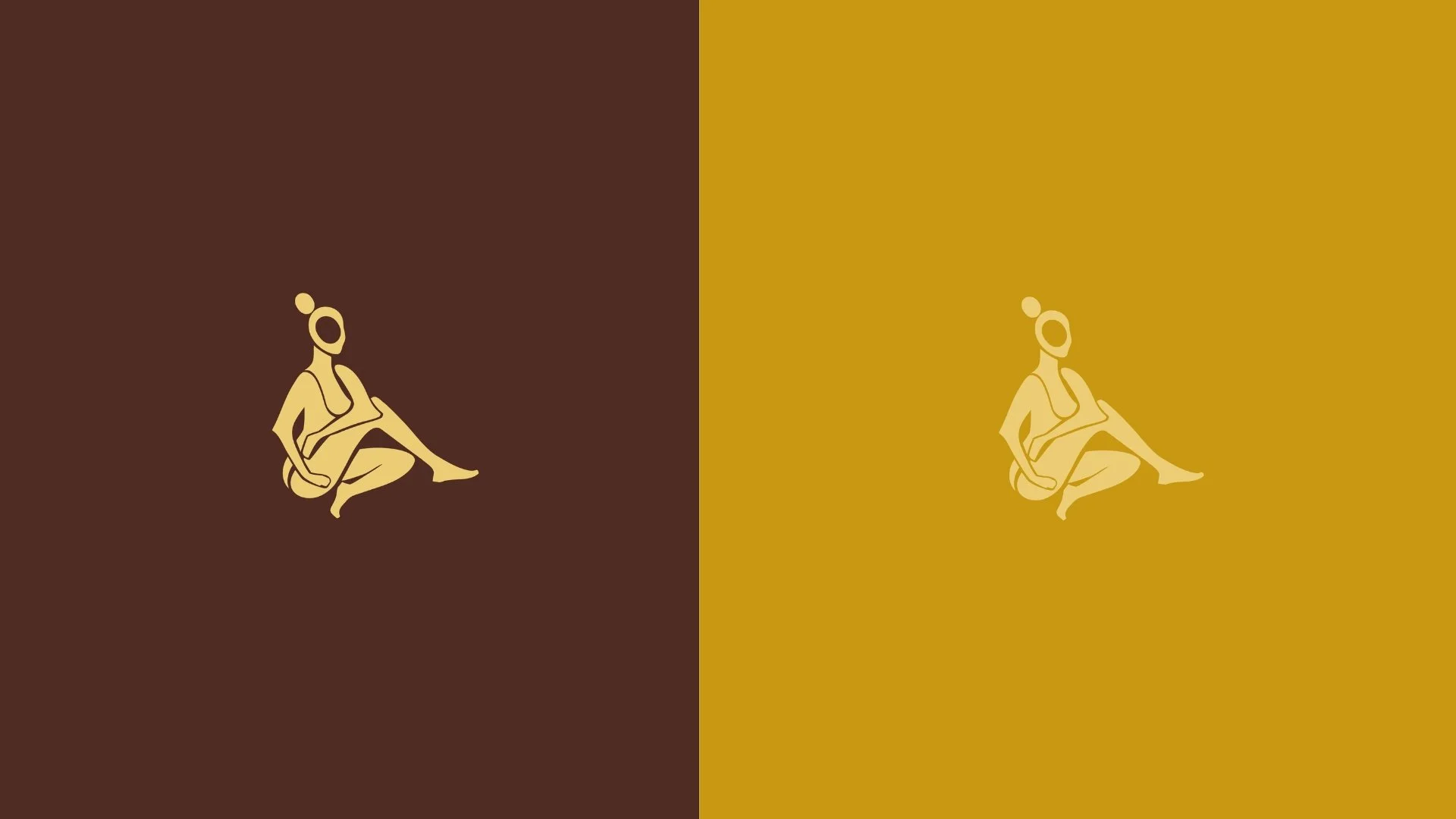
Cultural Intentionality: an illustrated feminine submark symbolizing inner peace and rooted strength
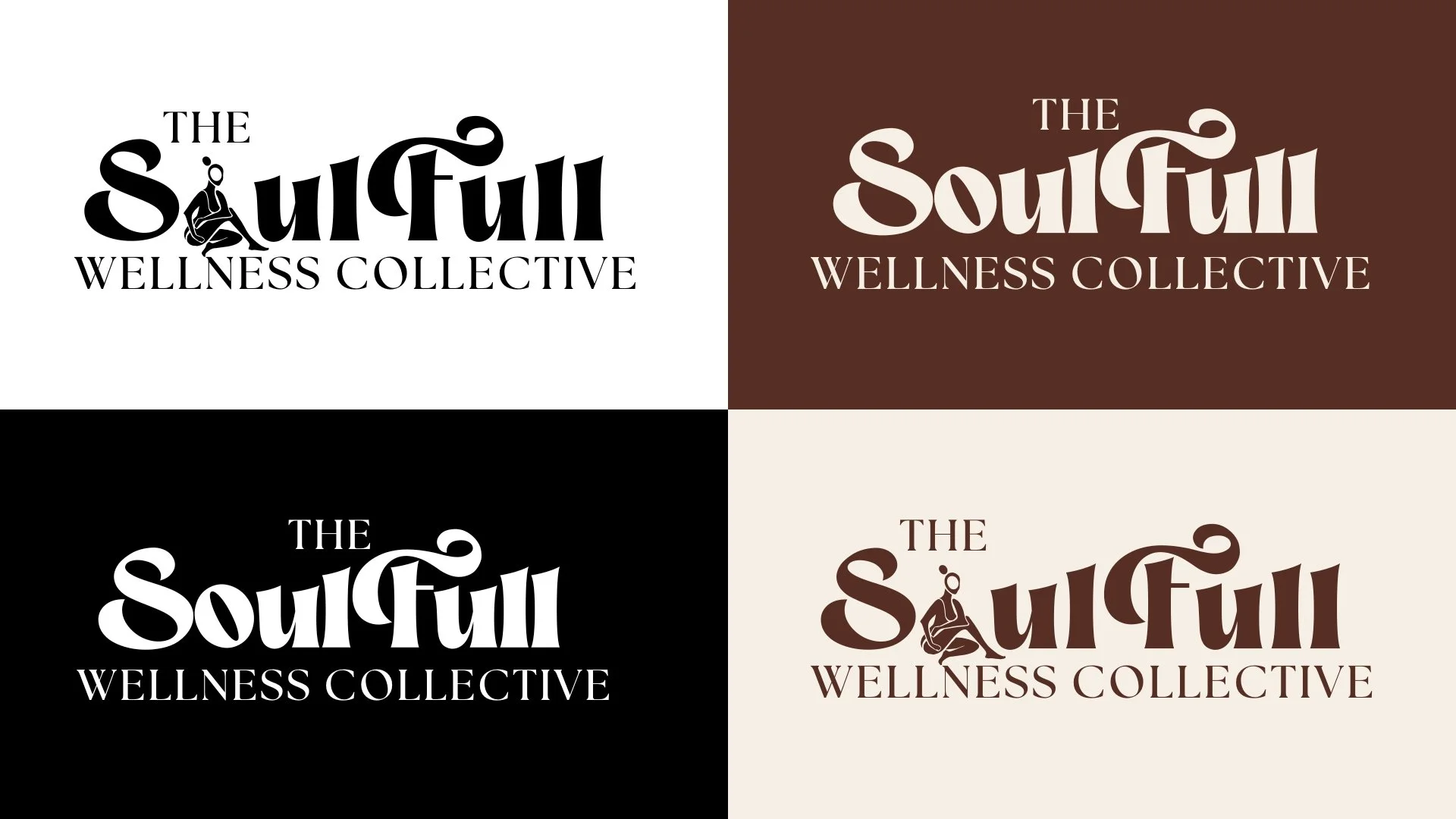
Artistic Expression: Matisse-style organic shapes and flowing typography
Scalability: a flexible system usable across events, retreats, social media, and merchandise
Deliverables
Full brand identity system
Logo suite + submark
Color palette
Typography system
Visual direction board
Brand guidelines PDF
Digital file package for all uses
The Challenge
SoulFull had a strong mission but lacked a cohesive visual identity. They needed:
A brand system aligned with cultural warmth and grounded wellness
A typography and color system matching their community
A flexible logo suite
Clear brand guidelines for consistent use across digital and print
A visual language that felt nostalgic yet modern
The core challenge was avoiding a corporate aesthetic while honoring the community-centered roots of the brand.
Creative Development
Typography: Magic Retro (primary) and The Seasons (accent) for a balance of boldness and sophistication.
Color Palette: Deep browns, burnt oranges, golden yellows, creams, and whites to evoke grounding and warmth.
Logo System:
Primary full wordmark
Secondary stacked/simplified logo
Custom submark featuring a seated figure representing wellness and femininity
Visual Language: Organic cutouts, soft silhouettes, textured layouts, and nostalgic warm tones.
Brand Guidelines
A full guideline system was created covering:
Logo usage + spacing
RGB/CMYK/HEX color codes
Proper file types (PNG, SVG, JPG)
Typography hierarchy
Do’s and Don’ts for maintaining consistency
Application guidelines across print and digital
Impact
The updated identity transformed SoulFull Wellness into a cohesive, emotionally resonant brand with a strong visual presence. Outcomes included:
Consistency across digital, print, and event touchpoints
Increased credibility for partnerships and collaborations
A visual system that reflects the brand’s cultural and community-centered core
A scalable foundation for future merch, content, and wellness activations
Reflection
This project became a cultural and creative translation of community wellness. The final identity is timeless, soulful, and aligned with the brand’s mission to make healing accessible, beautiful, and affirming.